an archive ·
Four ways to animate a scrolling page: what the home page was, before it became a town
For its first week, the home page of this site was a scroll animation. Four of them, really. Each one fixed something the last one broke on somebody's phone. The rule that held through all four: the page has to work when the animation doesn't.
1CSS scroll timelines, with a scrubbed fallback
The first page had three app cards tilted in space, and scrolling flew you through them. No
JavaScript ran per frame. CSS can tie a normal keyframe animation to the scroll position of an
element: animation-timeline names a view-timeline on the scene, and the
browser plays the animation as the scene moves through the screen.
The catch: not every browser had scroll timelines yet. So a few lines of script write the scroll
progress into one CSS variable, --p, and the same keyframes play paused,
scrubbed by a negative delay. One set of keyframes, two drivers.
.card {
  animation: fly linear both;
  animation-timeline: --zoom;
}
/* No scroll timelines: the script sets --p from 0 to 1 */
[data-motion="js"] .card {
  animation-timeline: auto;
  animation-duration: 1s;
  animation-play-state: paused;
  animation-delay: calc(-1s * var(--p, 0));
}
Use it for a short scene with a few things moving. It's the cheapest by far, and the browser does the work off the main thread.
2A camera flying through a paper diorama
Two days later the home page became the playground at dusk: a cut-paper diorama with one room per thing I make, a beach under a galaxy sky at the end. Each layer is an SVG with a pre-blurred shadow canvas behind it. The page itself is just a tall spacer. Scroll position becomes a camera position, the camera eases toward it every frame, and nothing draws when nothing moves.

Two small things made it feel right on a phone:
- Stop drawing what you've flown through. A layer behind the camera costs the same as one in front of it.
- Ignore taps while the page is still moving. A flick that starts on a card shouldn't open it.
Use it for a story with chapters. It costs real script and real testing, and it's the version people remembered.
3Pictures instead of vectors, for iPhones
On an iPhone the playground ran at about four frames a second. WebKit redraws a scaled SVG at every new scale, every frame, and every iPhone browser is WebKit underneath, Chrome included.
The fix: on touch screens each layer is drawn once into a canvas (at most twice the screen's density and 2048 px a side, cropped to what the camera will see), and only canvases move. The next room draws when you arrive, three rooms are alive at most. Laptops keep the live SVG.

One more: on a phone the toolbar slides away as you scroll, which resizes the page. The stage is
sized to the large viewport (100lvh), so that slide no longer rebuilds the
scene halfway through a flick.
The lesson: test on WebKit, not just Chrome on a laptop. It looked perfect everywhere I was looking.
4Stills for reduced motion
Some people turn motion off in their settings (prefers-reduced-motion). For them the
playground is the same rooms as a sequence of still pictures, each with its card. Same words, same
links, nothing flies. It's not a lesser page, it's the same page holding still.
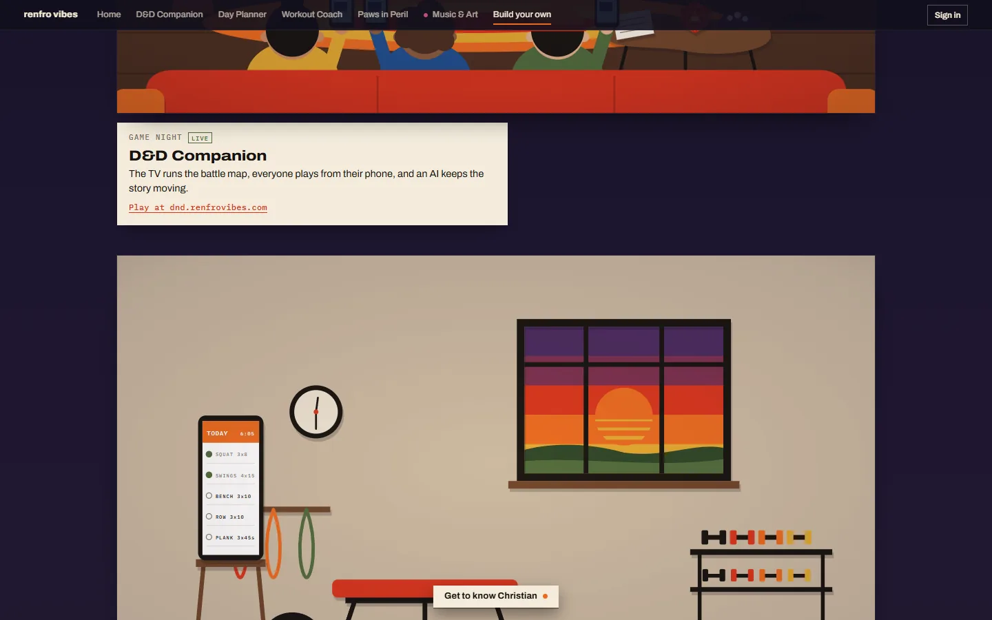
The story page took a different route to the same rule: Get to know Christian flies through a three.js star field, one chapter per stop, and without WebGL or with motion off it's a still sequence too.

/christian/, still running.5Why the home page became a town
A scroll animation is a show you watch. I wanted a place you walk around. So the home page is now a Western ghost town in 3D: you walk Lola the Bear down Main Street and every building is one of the things on this site.
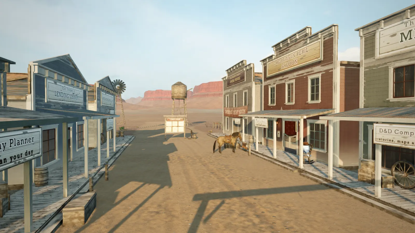
The rule came with it. The town is a click away, never a forced download: the page you land on is a plain list of every place in town that works on any phone and any browser, and the 3D only loads when you walk in.
If you're picking one for your own page:
- A short scene: CSS scroll timelines, with the
--pfallback. - A story with chapters: a script-driven camera over SVG or canvas.
- Phones: pictures, not vectors, and test on WebKit.
- Always: a still version that says everything the moving one does.
Go scroll the playground one more time, then come walk into town.